Facebook has started rolling out a new design for Facebook Pages on the desktop website that makes it easier for people to find the information they want, focusing on the newsfeed. As a result, Pages Apps are given less prominent on the page.
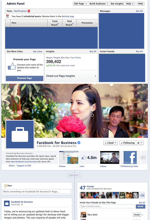
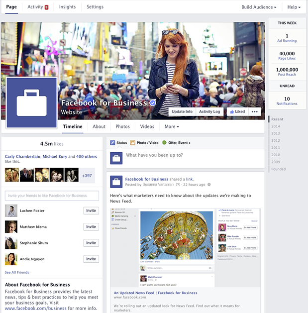
The Page layout will be updated to bring the design more in-line with the current Profile Page designs, which restores the timeline to a single-column layout with information on the left-side. The massive admin area above the cover image (when viewing as the administrator) will also be removed and replaced with tabs and summarised stats on the right side bar (where the ads usually appear).
Current Page Layout
New Page Layout
Although Facebook hasn’t revealed how the User-facing view will change, it’s clear from the images above that the App tabs are being removed and placed under the “More” tab. Visitors to the page will have to make a few more clicks before they can access your Page Apps.
It seems like Facebook are putting less and less focus on Page Apps, from first removing the “default landing page” for new visitors to now moving Page App Tabs off the main view. Could Facebook be thinking about removing Page Apps altogether?


Trackbacks/Pingbacks